
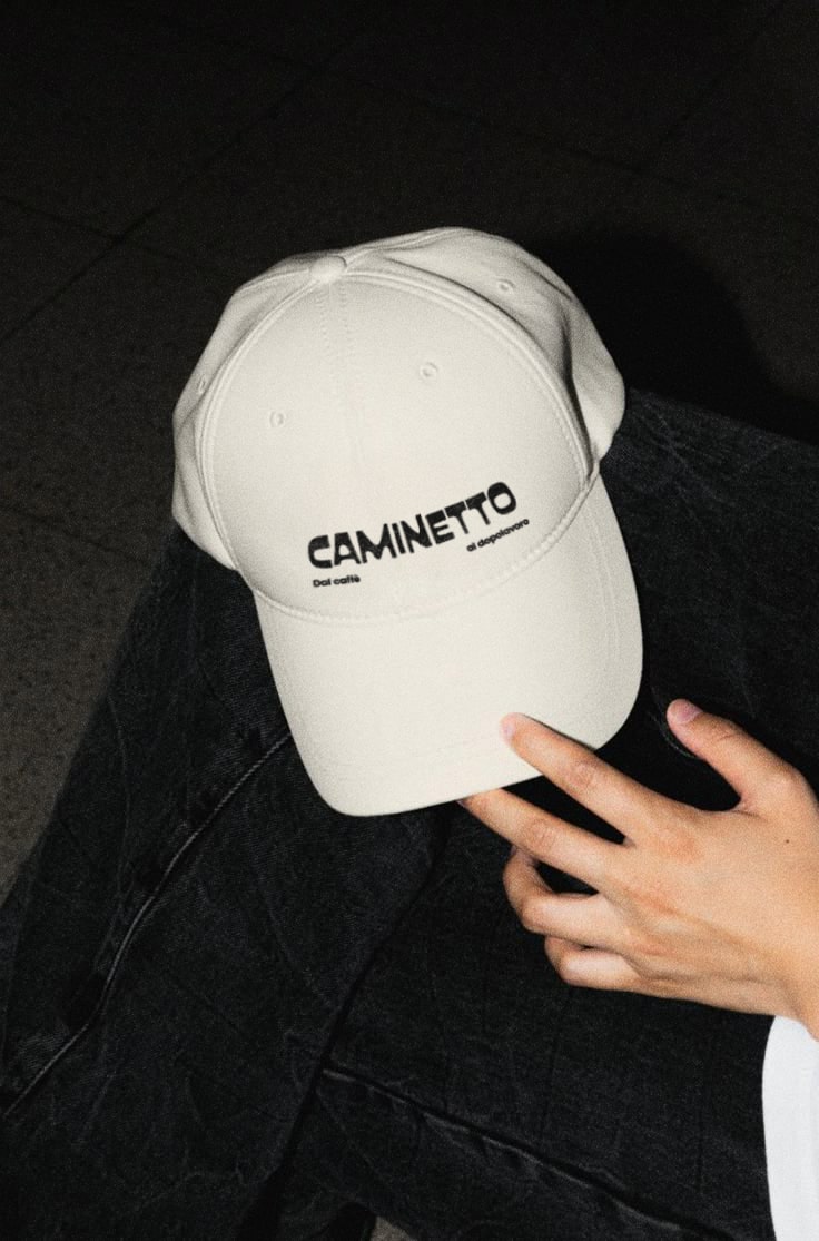
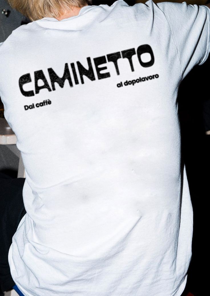
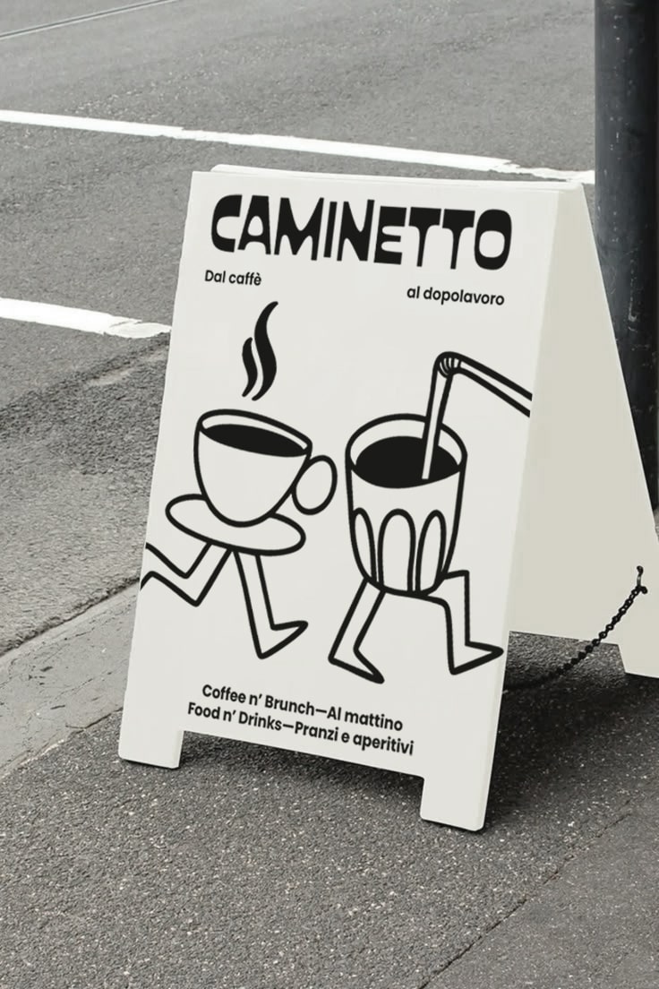

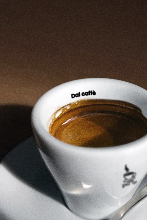

The Caminetto project was conceived with the goal of creating a visual identity that conveys the venue’s versatility and welcoming atmosphere, transforming it into a reference point for different moments of the day.
The chosen font, soft and inviting, was selected to evoke the warmth and conviviality that define Caminetto. The payoff “Dal caffè al dopolavoro” (From coffee to after work) plays with empty spaces between words to emphasize that Caminetto is not just a café but a meeting place that accompanies people from breakfast to an evening drink.
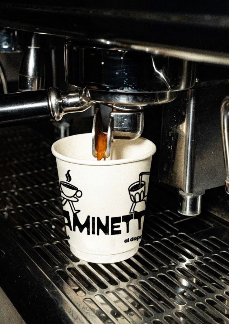
The mascot becomes the centerpiece of the visual identity: a versatile and dynamic character whose moving legs symbolize the seamless transition between the different experiences offered by the venue. This mascot adapts to various menu categories, transforming into a cup of coffee, a cocktail, a croissant, or a glass of wine, visually reinforcing the concepts of flexibility and inclusivity.
This solution allows for different variations of the mascot to be developed for social media communication and the menu, ensuring graphic consistency and immediate recognizability. Caminetto’s identity thus becomes functional and distinctive, moving beyond the conventional image of a simple café and establishing itself as a meeting place for every moment of the day.
This project reflects a thoughtful and strategic artistic direction, aiming to build a strong, accessible, and recognizable brand identity.
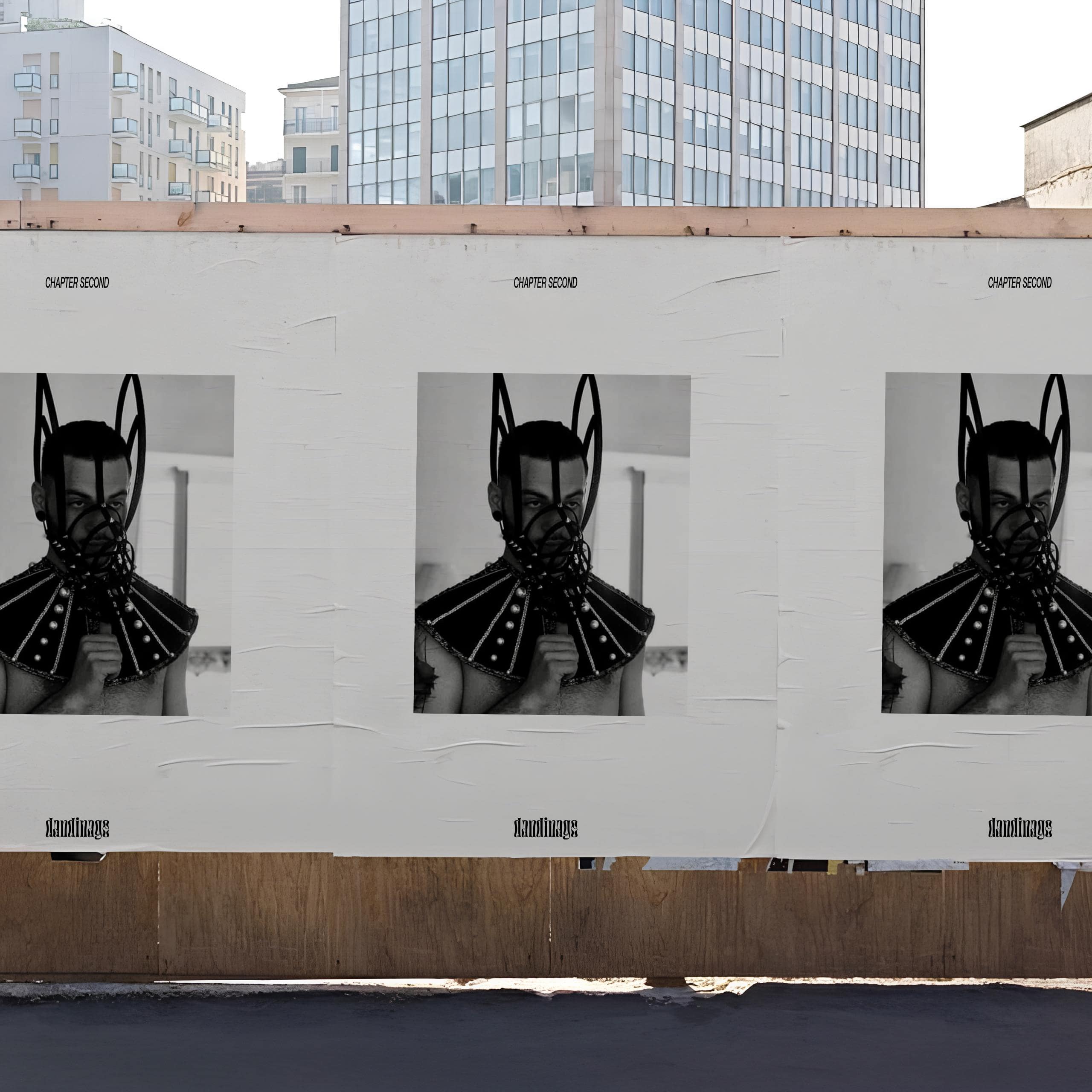
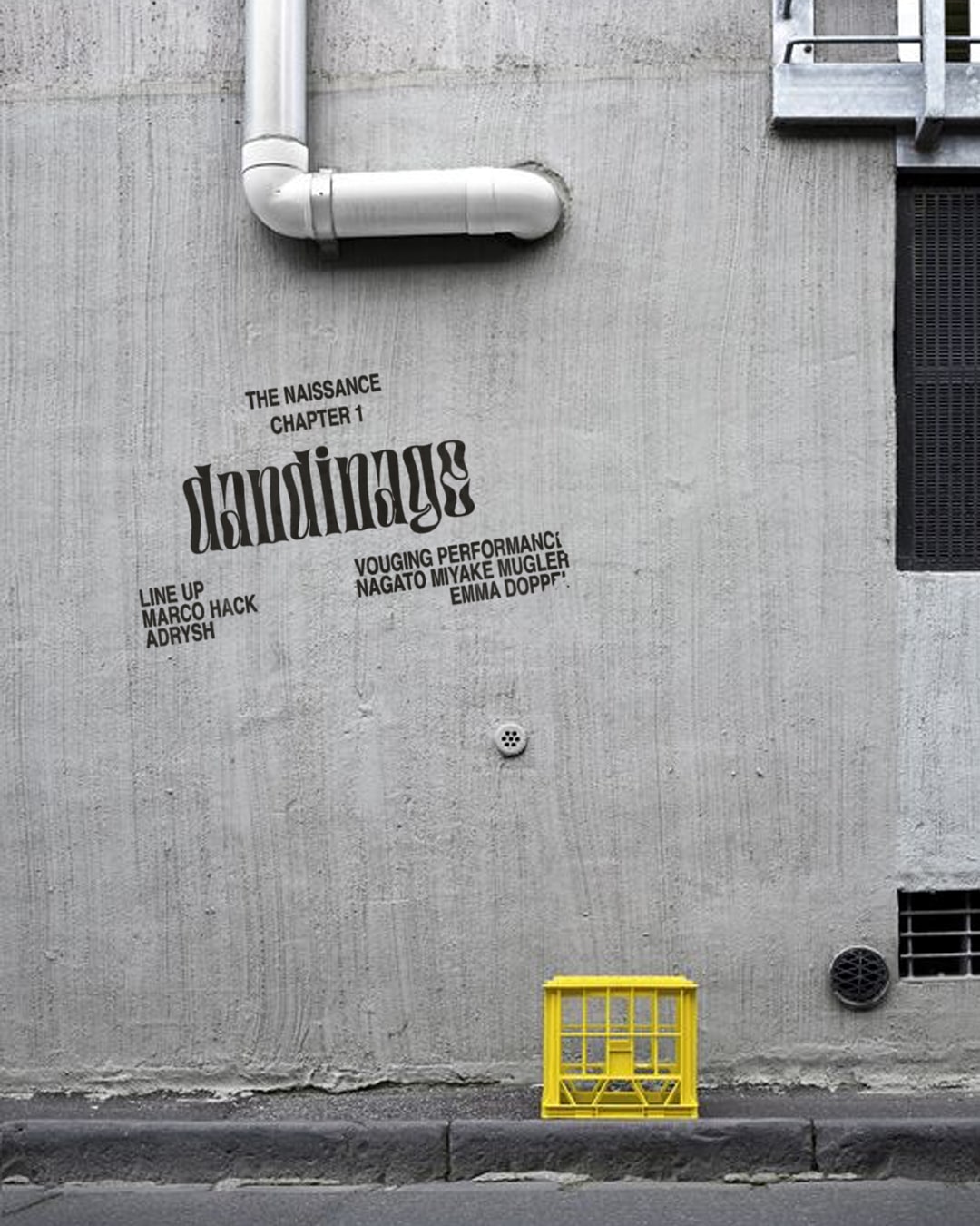
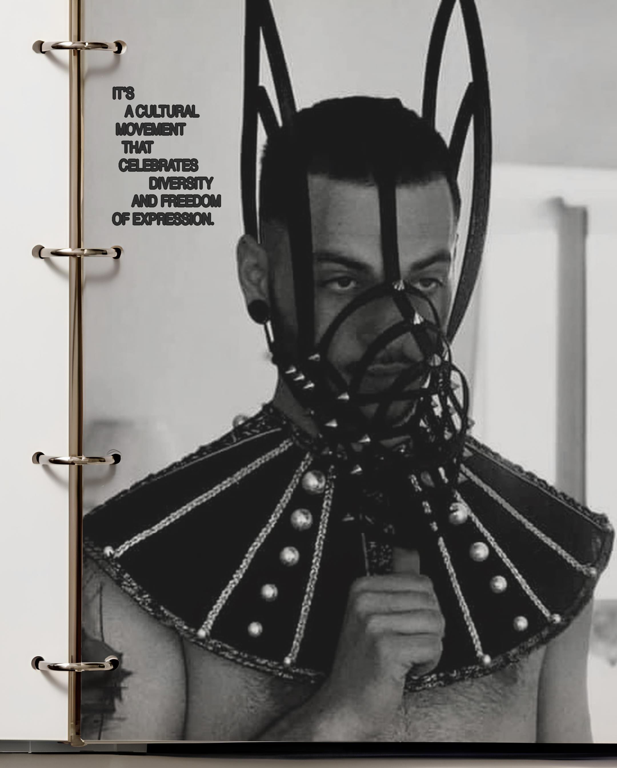
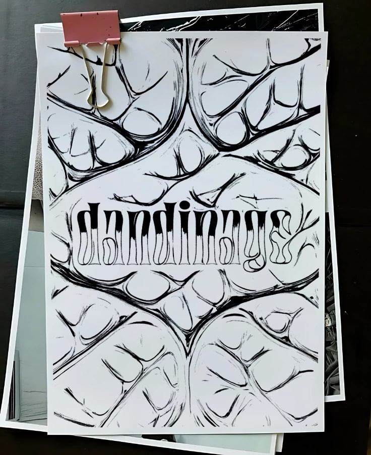
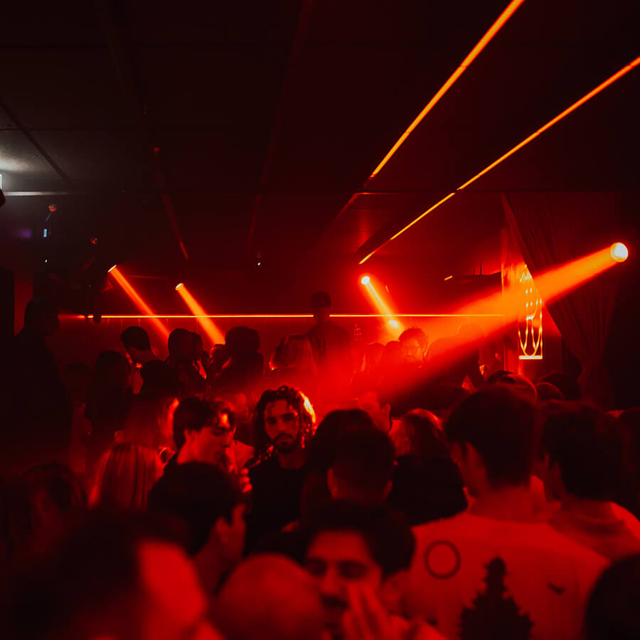
Dandinage is a project founded and curated by Eleonora Sicolo and Elisa Gigliotti, with the goal of redefining queer nightlife through an immersive, multidisciplinary experience. Born in Milan as a response to the challenges faced by the LGBTQIA+ community in historically queer spaces, Dandinage is an event that weaves together art, performance, and club culture to create a safe and inclusive environment. The name, inspired by the French word for “swaying,” symbolizes the fluidity and resilience of queer identity.
Concept and Artistic Direction
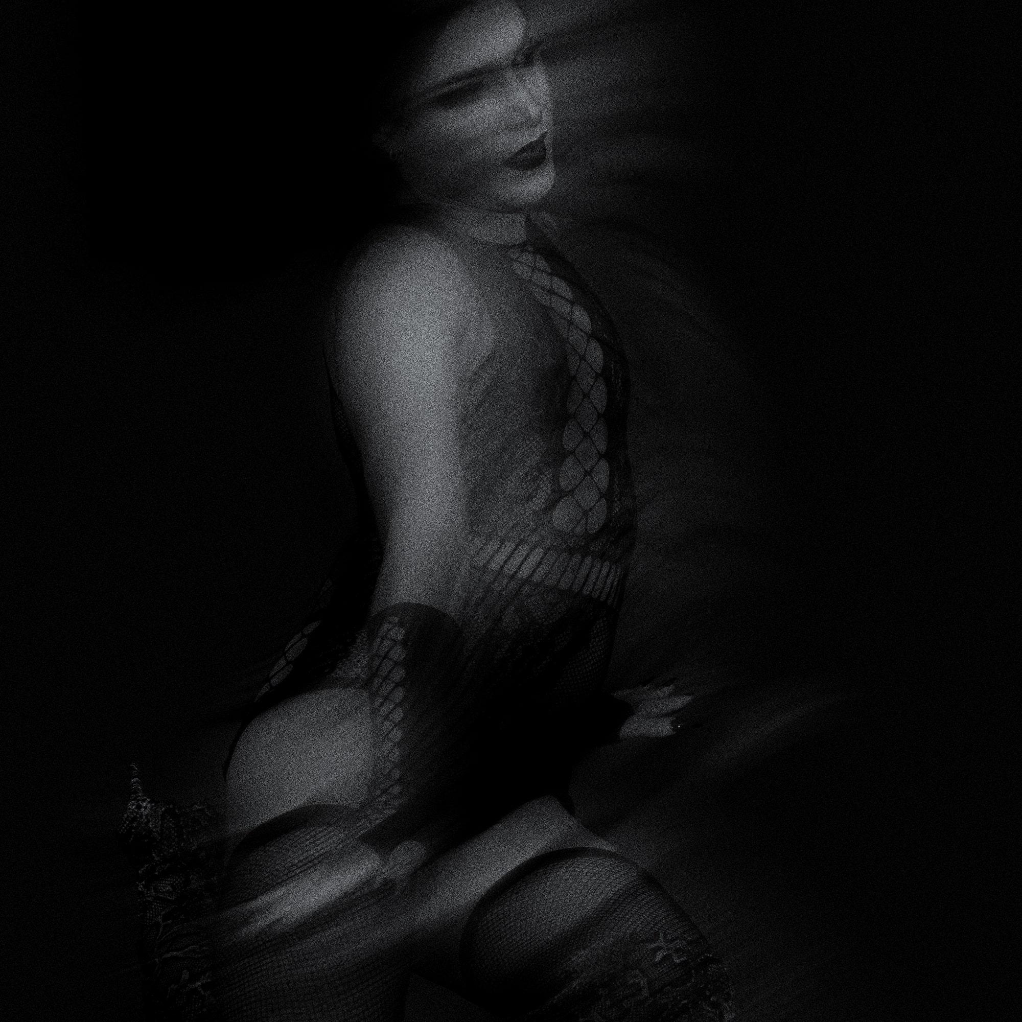
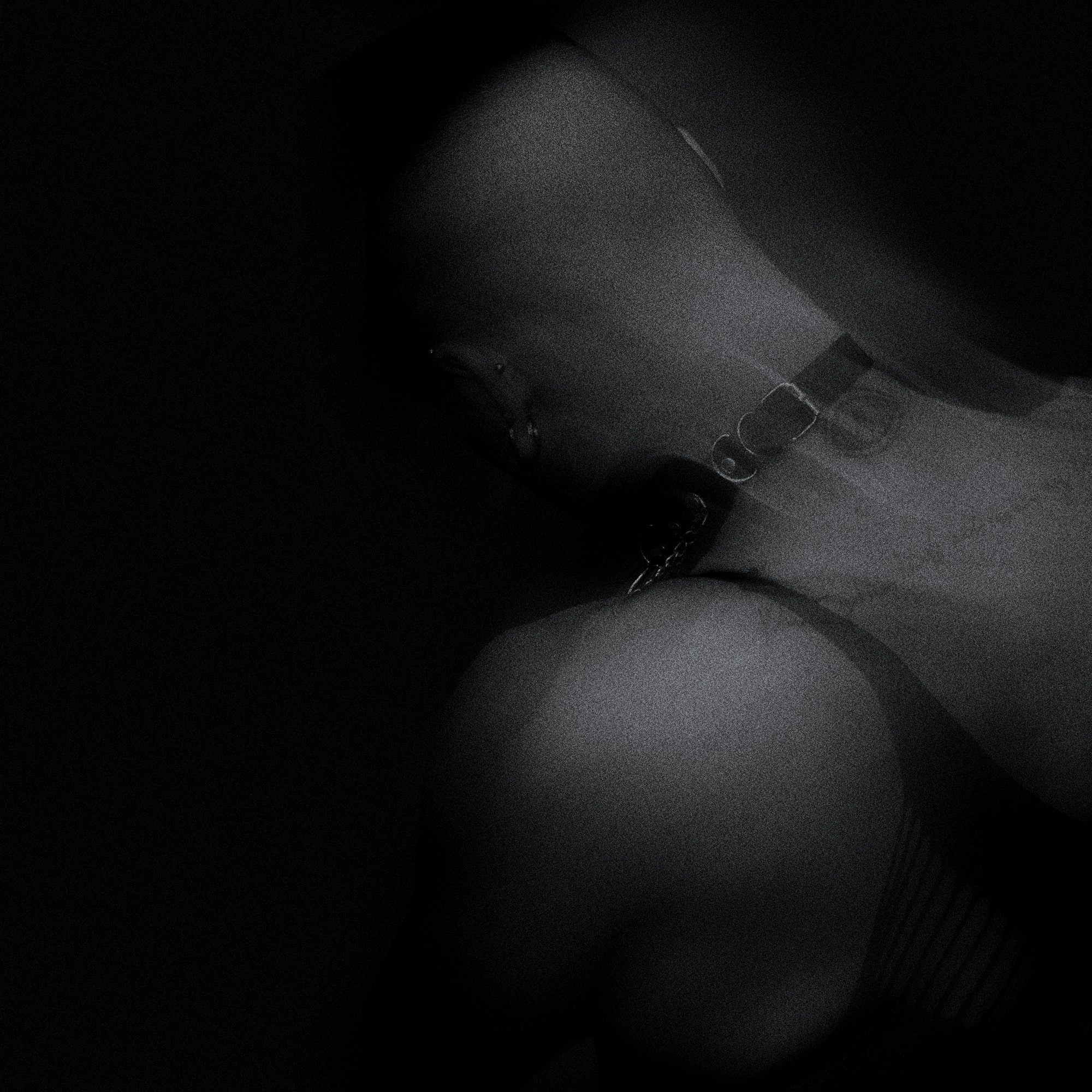
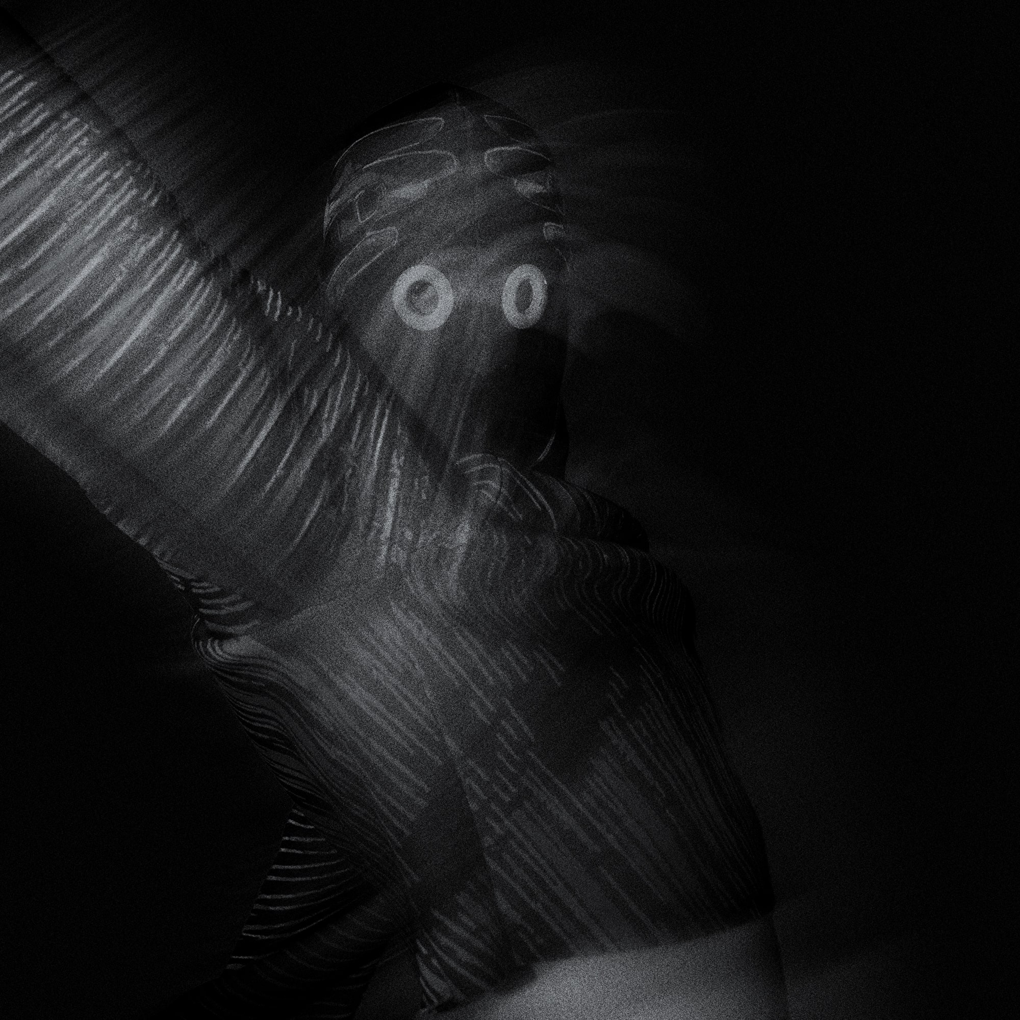
The project is structured in chapters, each featuring a unique visual and performative narrative. Every event is a thematic exploration that blends avant-garde aesthetics, references to the history of club culture, and a strong message of freedom and self-expression. For the second chapter, “CHAPTER SECOND,” we drew inspiration from the iconic Club Kids movement of 1980s/90s New York, combining elements of futurism and social critique.
The artistic direction focused on:
~ A lineup of queer performers spanning voguing, drag performances, interactivity, and sex expression performances.
~ Set design that transforms the space into an immersive, visionary environment.
~ Visual identity inspired by underground club aesthetics, combined with digital elements and glitch art.
Role and Contribution
We were responsible for:
~ Artistic direction and concept development.
~ Visual identity and communication.
~ Selection and coordination of performers and DJs.
~ User experience and curation of interactive spaces.
Dandinage is not just a party, but a cultural movement that celebrates diversity and freedom of expression. Through a powerful visual and performative language, the project aims to build a bridge between club culture, contemporary art, and queer activism.
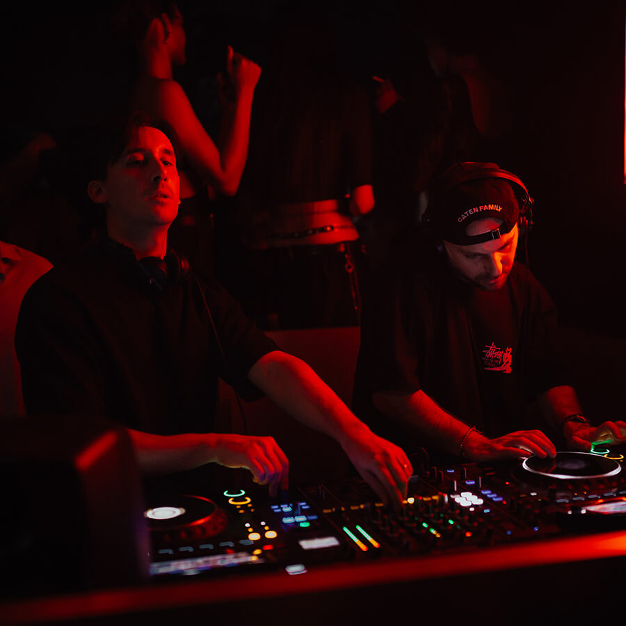

The role involves the artistic direction of the collective's events at Club Repvblic in Milan. In addition to creating social media content to promote the events, handling photo editing, and managing the sound, we are also responsible for the lighting and ambiance during the event to ensure a consistent and engaging atmosphere. We collaborate, when necessary, with the floor manager to coordinate the flow of the event and provide support to the artists.
Ph: Vittorio La Fata
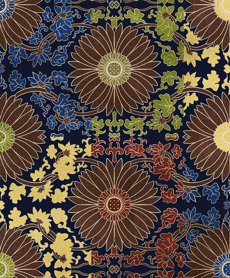
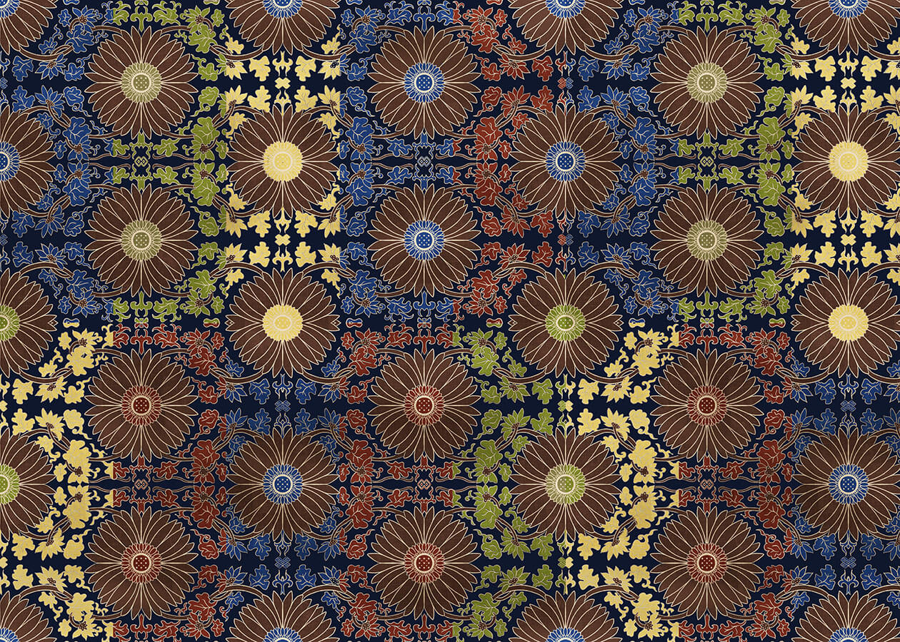
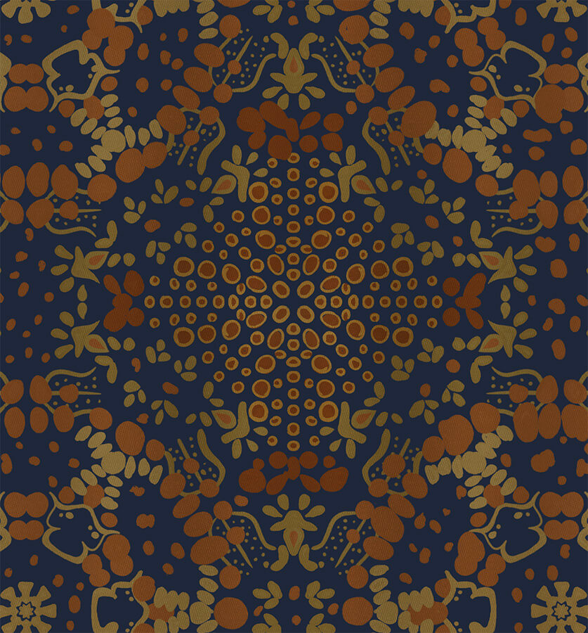
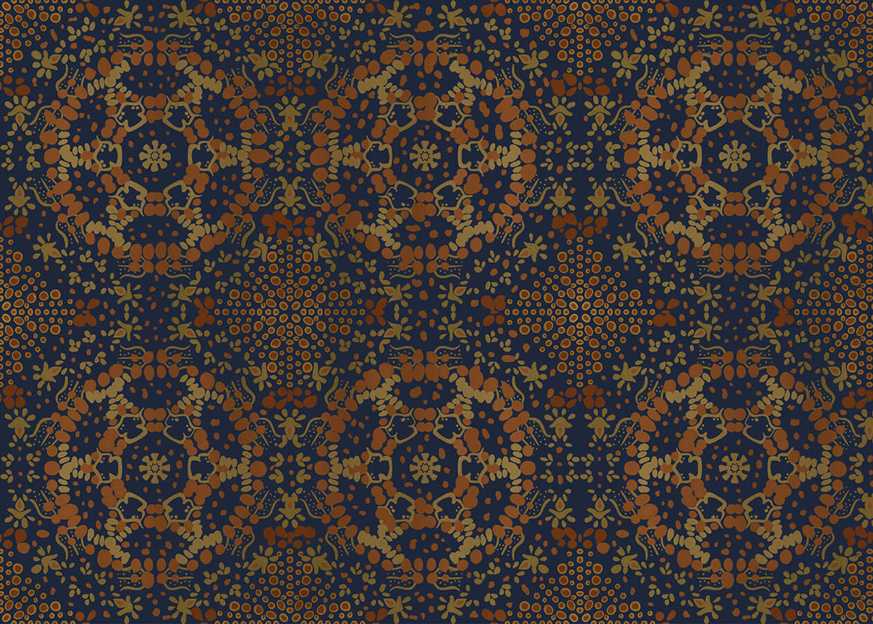
The patterns were developed for a personal project by Jamie Sharp and are entirely hand-drawn, inspired by ancient fabrics. Every detail has been carefully crafted to highlight imperfection and give the result an authentically artisanal aesthetic. In particular, the second pattern is inspired by a Russian fabric dating from the period between 1700 and 1899. The sense of "handmade" was the core of the creative process.

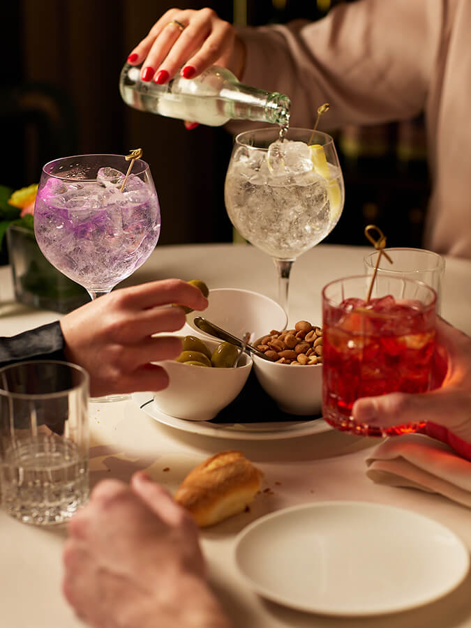

The collaboration with Paper Moon continued with an integrated artistic direction role alongside social media management and content creation for the official Instagram profile @papermoon.giardino.milano. The project included managing and organizing targeted photoshoots aimed at creating visual content consistent with the brand's identity. A monthly editorial plan was then developed, including the scheduling and posting of posts, stories, and special content, with the goal of strengthening Paper Moon Milano’s online presence. Additionally, customized communication strategies were devised and implemented to increase engagement, optimize visibility, and strengthen the follower community, always respecting the brand’s values and distinctive image.

The collaboration with Paper Moon aimed at creating brand social guidelines to standardize the group's Instagram profiles and provide detailed instructions to support future partners. The work included developing a consistent visual system and organizing key graphic and communicative elements. This project was further enriched by artistic direction, ensuring a creative strategy and a distinctive visual identity, while maintaining perfect alignment with the brand’s values.
