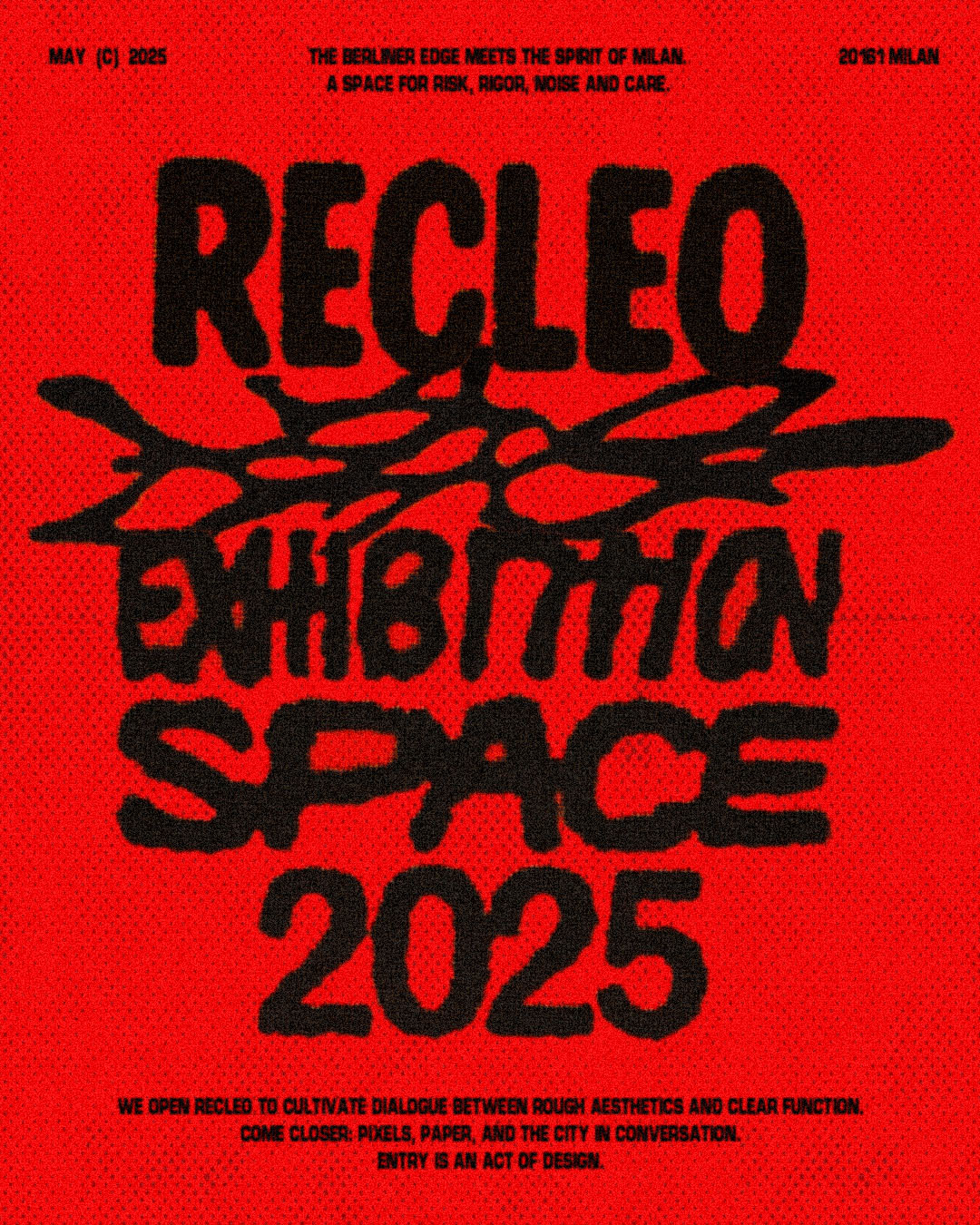
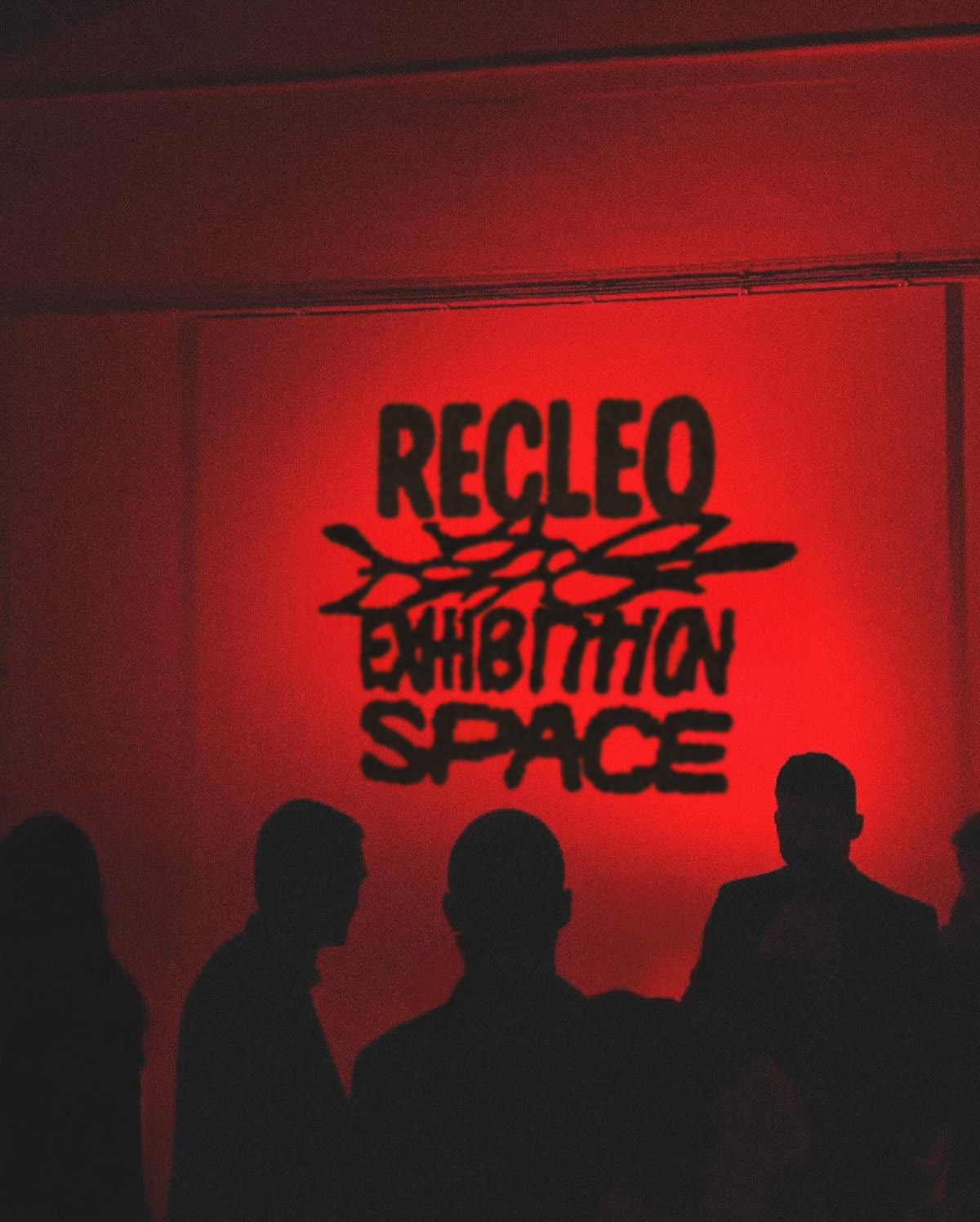
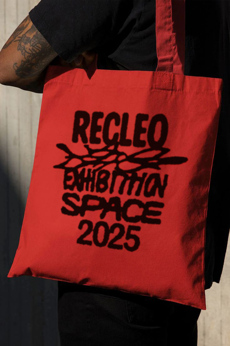
Recleo is an exhibition space founded in Milan. For the opening we developed an identity that plays with Berlin grit: black on red, heavy compressed type, a pronounced halftone, and a central scribble used as a live mark. The typographic hierarchy is stripped to the essentials — RECLEO, EXHIBITION SPACE, 2025 — with tight tracking and dense blocks. The scribble weaves into the typography as both bridge and interference. A wide halftone and controlled micro-imperfections give the work a tactile presence that holds up in digital. Red as the field, solid black for type and marks.
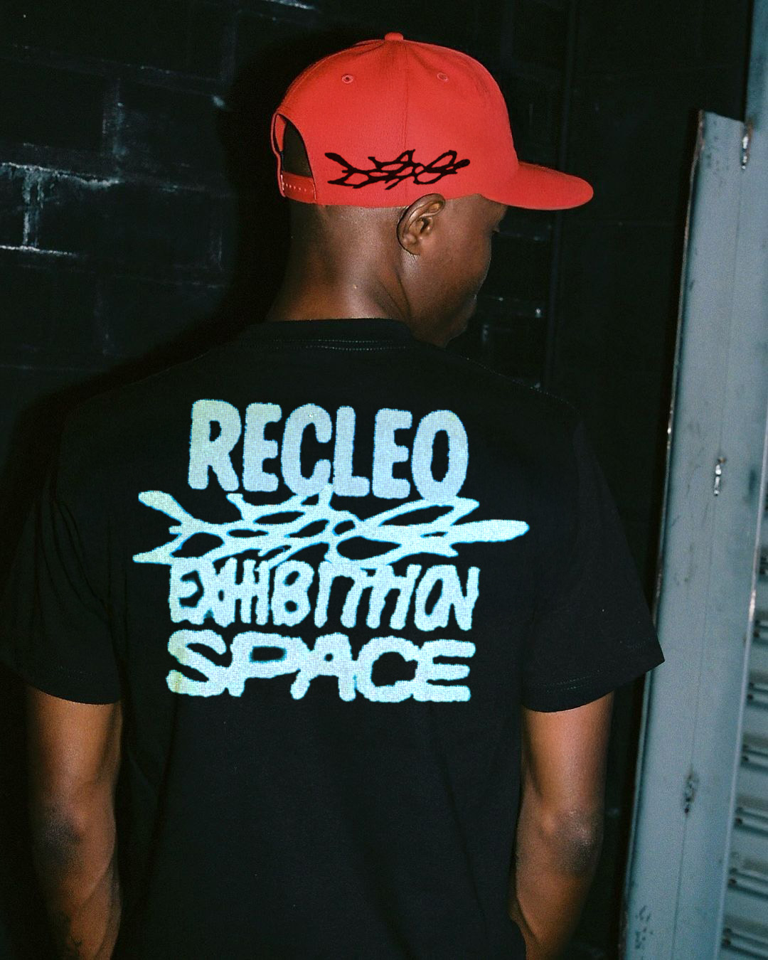
The identity stays consistent across all touchpoints: campaign posters and launch materials, in-space projections during the opening, apparel and accessories with high-contrast applications, social assets for feed and stories, and essential wayfinding for entry and hours.
Outcome. A direct, recognizable language that works across posters, physical space, and product. The scribble becomes an identifying sign and a navigation tool; the compressed typography builds a strong presence, readable at poster scale and sharp on garments and accessories. Together it sets Recleo’s tone: experimental, urban, precise.