
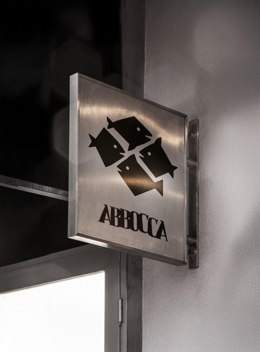
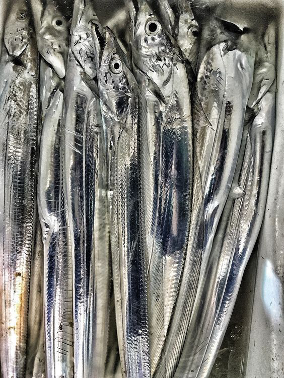
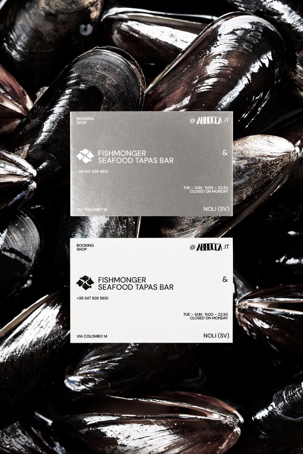
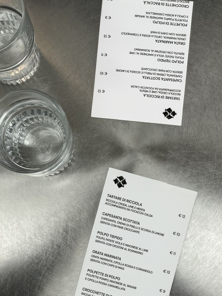
Abbocca is a Seafood Tapas Bar. Its visual identity is built around steel: a material that recalls the sleek, reflective skin of fish, cold yet luminous, able to capture the essential atmosphere of the place. Black and white are the only colours, used in sharp contrast and enhanced by clean lighting and minimalist cuts.
The logo depicts a small school of fish moving together, drawn with an instinctive stroke that avoids rigid geometry. Typography extends the visual language: the word Abbocca shifts and collides, with letters that press and clash as if mimicking the sudden dart of a fish taking the bait. A sense of dynamism that breaks the static nature of the written sign and translates the essence of the name into a visual gesture.
Every application remains consistent with the sober, metallic language of the space, allowing the true protagonist to remain the fish — displayed and served at the centre of the experience.
Outcome. A minimal and decisive identity that uses steel, light, and moving typography to express the freshness of the sea. Abbocca presents itself as a clean, direct space where the raw material emerges without superstructures.
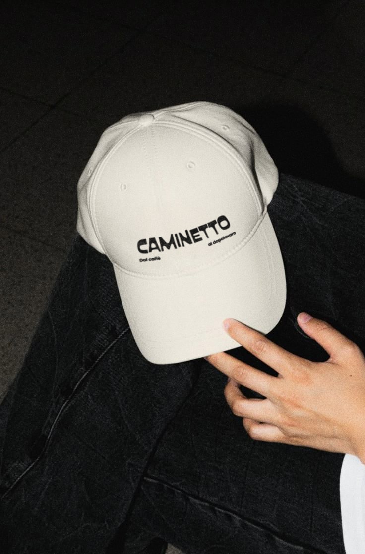
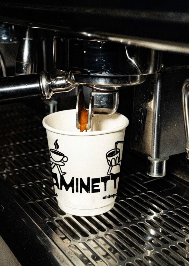
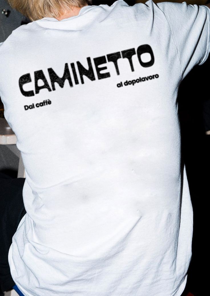
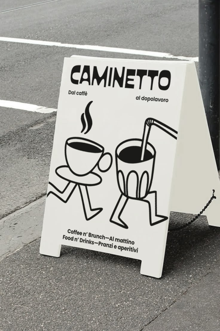

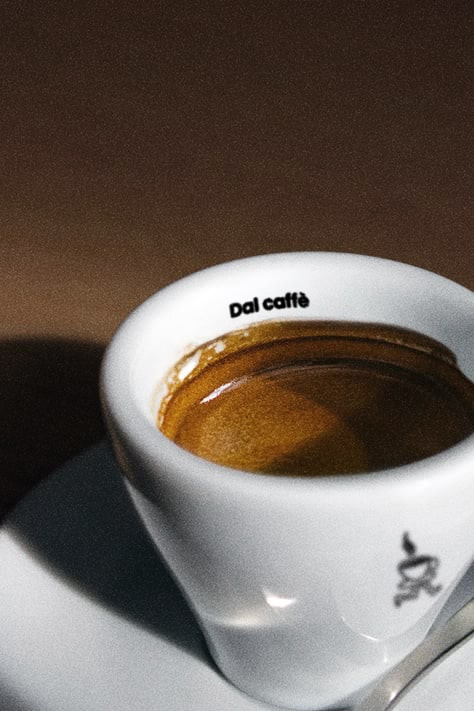

The Caminetto project was developed with the goal of creating a visual identity that conveys the venue’s versatility and welcoming spirit, positioning it as a reference point for different moments of the day.
The typography, soft and approachable, was chosen to evoke the warmth and conviviality that define the Caminetto experience. The payoff “Dal caffè al dopolavoro” (“From coffee to after work”) plays with spacing between words to express the idea that Caminetto is not just a café, but a meeting place that accompanies people from breakfast through to evening drinks.
At the heart of the identity is the mascot: a dynamic character with legs in motion, symbolising the fluid transition between the different experiences offered by the venue. The mascot adapts to context — transforming into a coffee cup, a glass of wine, a cocktail, or a croissant. This modularity allows the visual system to be easily applied across menus, merchandise, and social communication, while ensuring coherence and recognisability.
Outcome. A functional and distinctive identity that moves beyond the classic image of a simple café-bar, positioning Caminetto as a contemporary and welcoming space designed to accompany every moment of the day.

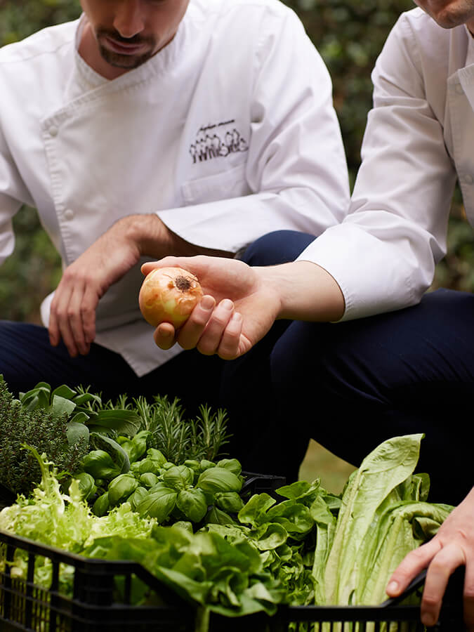
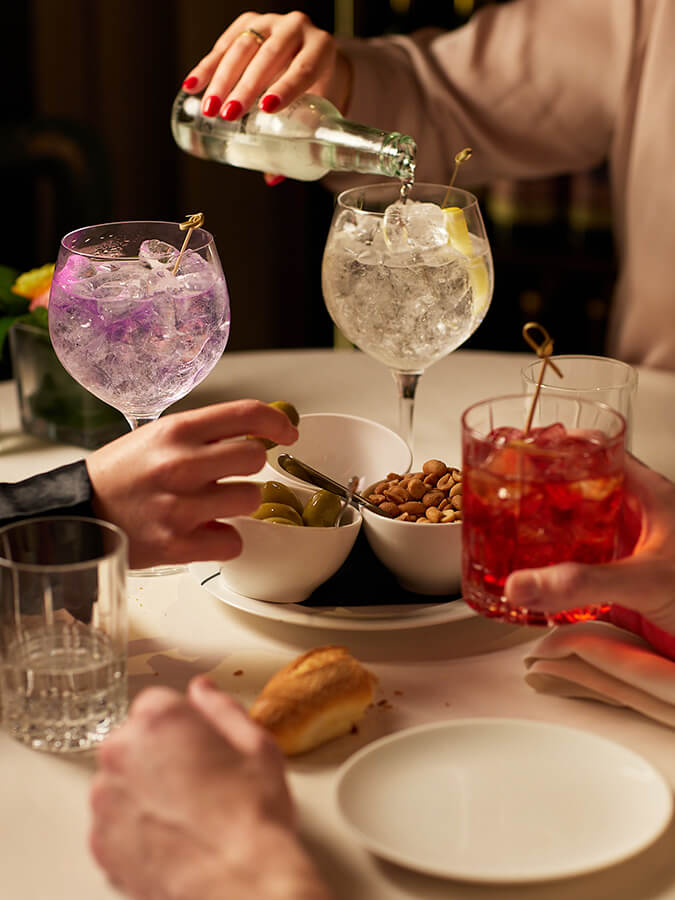

The collaboration with Paper Moon continued with an assignment that combined art direction, social media management, and content creation for the official profile @papermoon.giardino.milano. The goal was to strengthen the restaurant’s digital presence and build a visual narrative aligned with the brand’s identity and values.
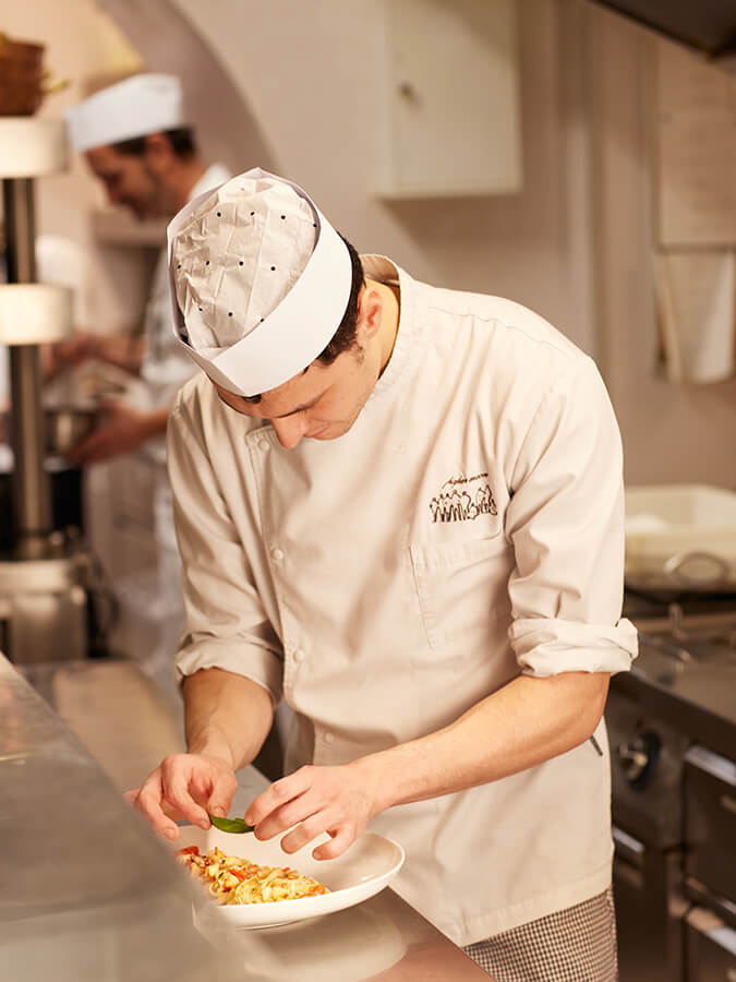
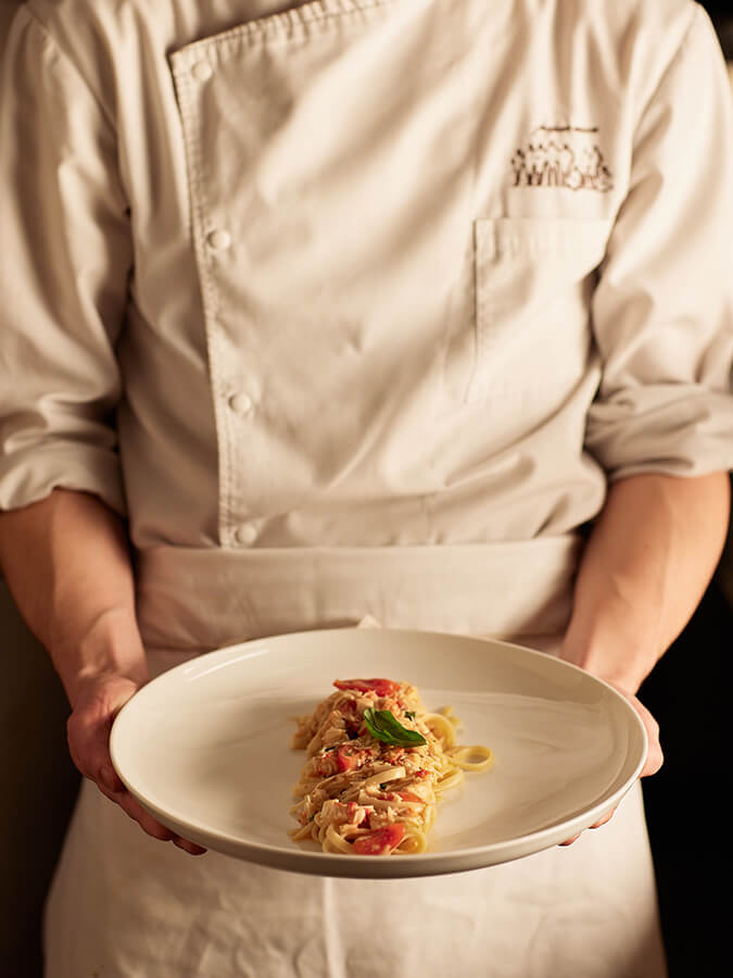
The project began with the organization of targeted photo shoots designed to capture and enhance every aspect of the Paper Moon experience: from the selection of raw ingredients to the work of the kitchen brigade, all the way to service and the customer journey in the dining room. The art direction defined a precise visual language that conveys both elegance and authenticity, balancing refinement with warmth.
In parallel, a monthly editorial plan was developed, covering the scheduling and publication of feed content, stories, and special materials dedicated to events and seasonality. Tailored communication strategies were implemented to increase engagement, boost visibility, and strengthen the digital community, while remaining true to Paper Moon’s distinctive identity.
Outcome. A curated and coherent social presence that translates into digital the same attention to detail that defines the in-house experience. The Instagram profile becomes a strategic tool: a channel to reinforce brand awareness, engage with the audience, and consolidate the restaurant’s positioning.

The collaboration with Paper Moon stemmed from the need to unify the digital communication of all the group’s restaurants worldwide. The assignment focused on the creation of shared brand social guidelines, designed to ensure visual and strategic consistency across the various Instagram profiles and to provide clear directives for future partners.
The project began with in-depth research and analysis of the existing profiles, aimed at identifying visual inconsistencies, communication misalignments, and operational needs. From this groundwork, we developed a unified visual system, structuring key graphic and communication elements: colour palettes, typography, layouts, feed and stories formats, tone of voice, and publishing best practices. Art direction then translated the findings of the analysis into a coherent strategy, delivering practical tools and a digital identity aligned with the brand’s values and positioning.
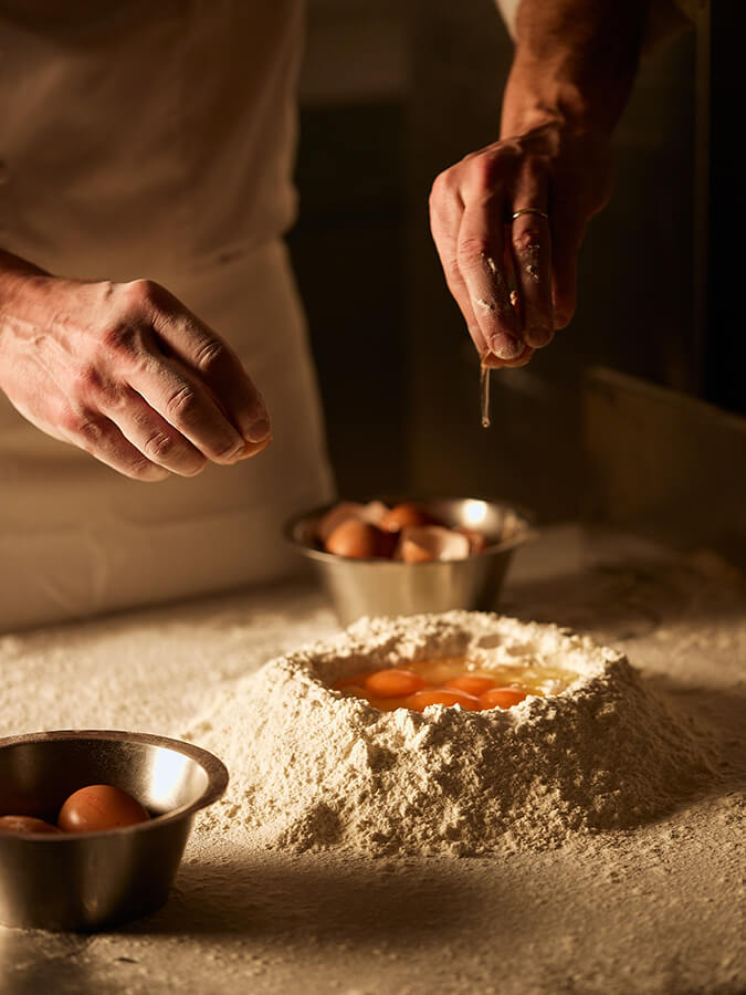
For reasons of confidentiality, we cannot share the developments or the final outcome of the brand guidelines. The images accompanying this description come from photo shoots carried out under our art direction.
Outcome. A clear and structured set of guidelines, capable of ensuring recognition and consistency on a global scale. The social guidelines become a practical and shared tool to support Paper Moon and its partners within a coherent and effective digital ecosystem.