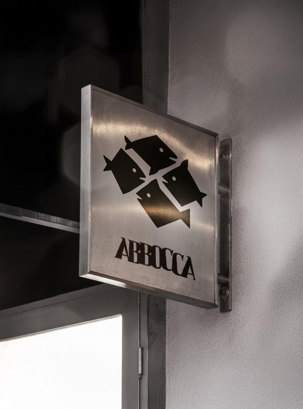
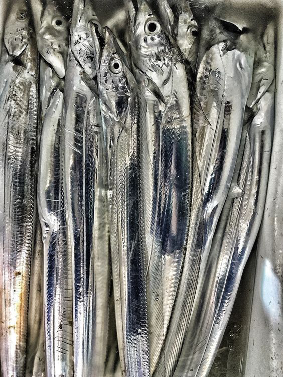
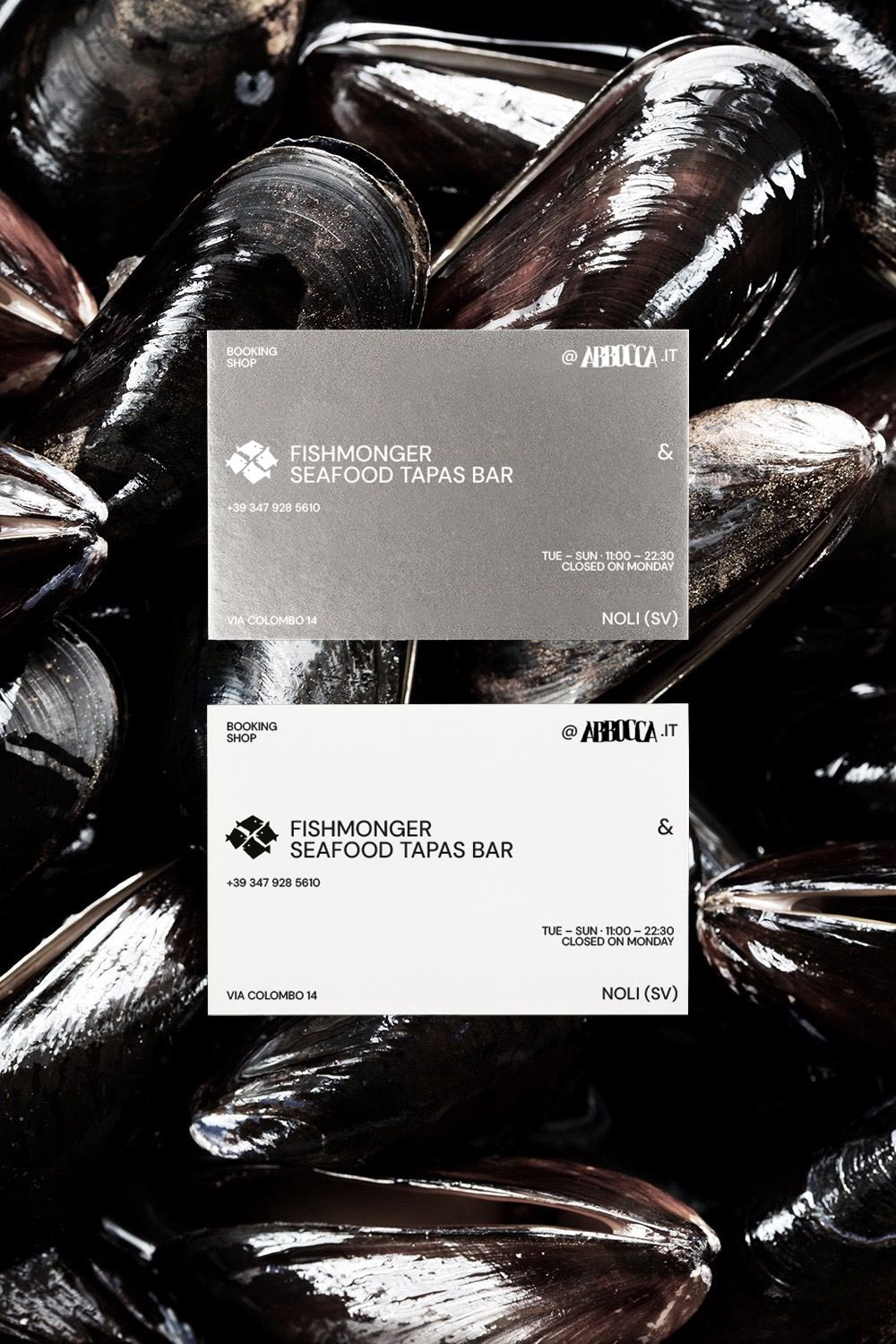
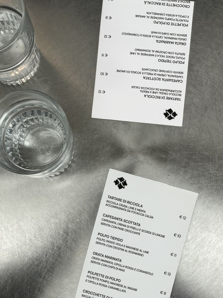
Abbocca is a Seafood Tapas Bar. Its visual identity is built around steel: a material that recalls the sleek, reflective skin of fish, cold yet luminous, able to capture the essential atmosphere of the place. Black and white are the only colours, used in sharp contrast and enhanced by clean lighting and minimalist cuts.
The logo depicts a small school of fish moving together, drawn with an instinctive stroke that avoids rigid geometry. Typography extends the visual language: the word Abbocca shifts and collides, with letters that press and clash as if mimicking the sudden dart of a fish taking the bait. A sense of dynamism that breaks the static nature of the written sign and translates the essence of the name into a visual gesture.
Every application remains consistent with the sober, metallic language of the space, allowing the true protagonist to remain the fish — displayed and served at the centre of the experience.
Outcome. A minimal and decisive identity that uses steel, light, and moving typography to express the freshness of the sea. Abbocca presents itself as a clean, direct space where the raw material emerges without superstructures.
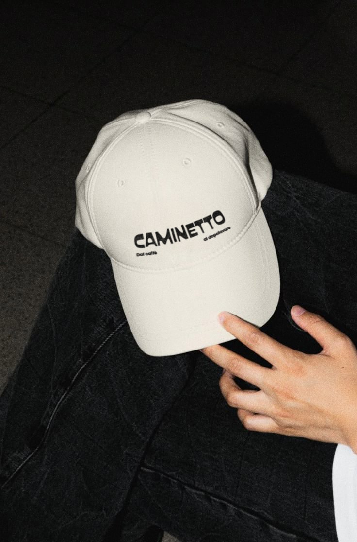
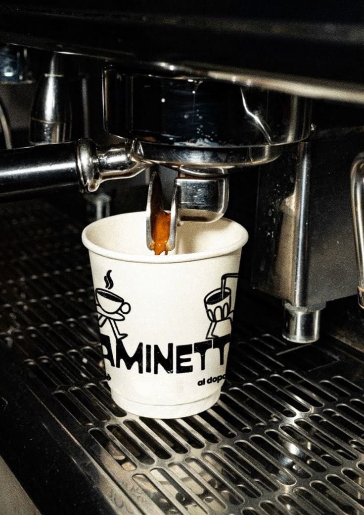
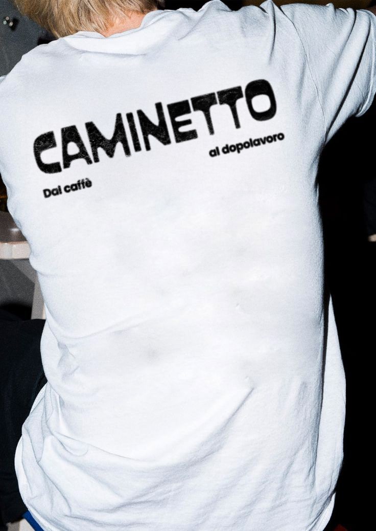
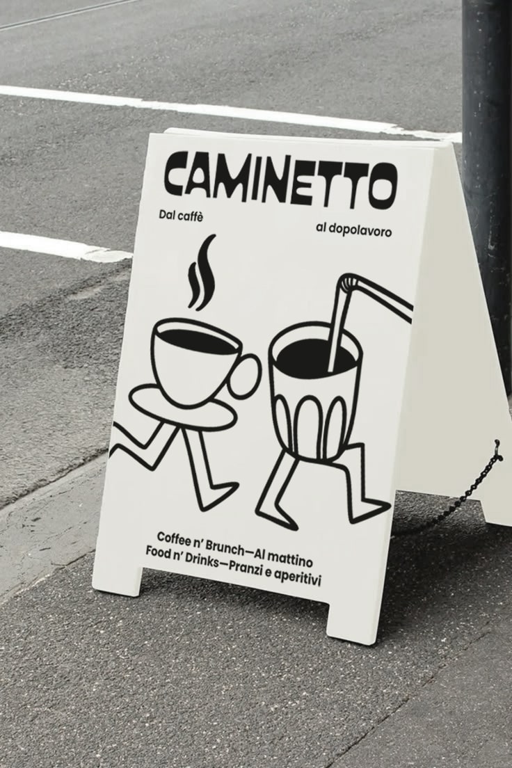

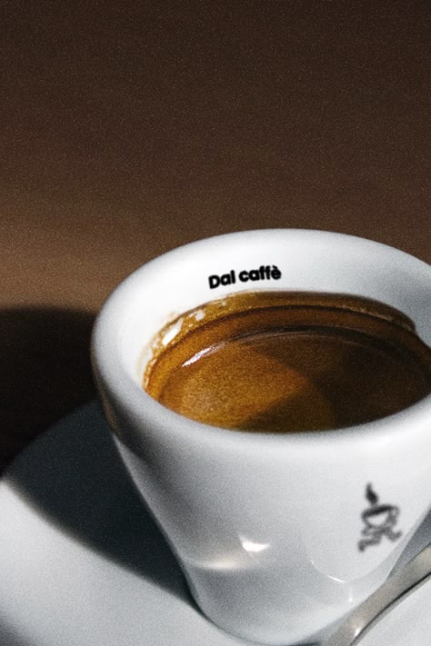

The Caminetto project was developed with the goal of creating a visual identity that conveys the venue’s versatility and welcoming spirit, positioning it as a reference point for different moments of the day.
The typography, soft and approachable, was chosen to evoke the warmth and conviviality that define the Caminetto experience. The payoff “Dal caffè al dopolavoro” (“From coffee to after work”) plays with spacing between words to express the idea that Caminetto is not just a café, but a meeting place that accompanies people from breakfast through to evening drinks.
At the heart of the identity is the mascot: a dynamic character with legs in motion, symbolising the fluid transition between the different experiences offered by the venue. The mascot adapts to context — transforming into a coffee cup, a glass of wine, a cocktail, or a croissant. This modularity allows the visual system to be easily applied across menus, merchandise, and social communication, while ensuring coherence and recognisability.
Outcome. A functional and distinctive identity that moves beyond the classic image of a simple café-bar, positioning Caminetto as a contemporary and welcoming space designed to accompany every moment of the day.
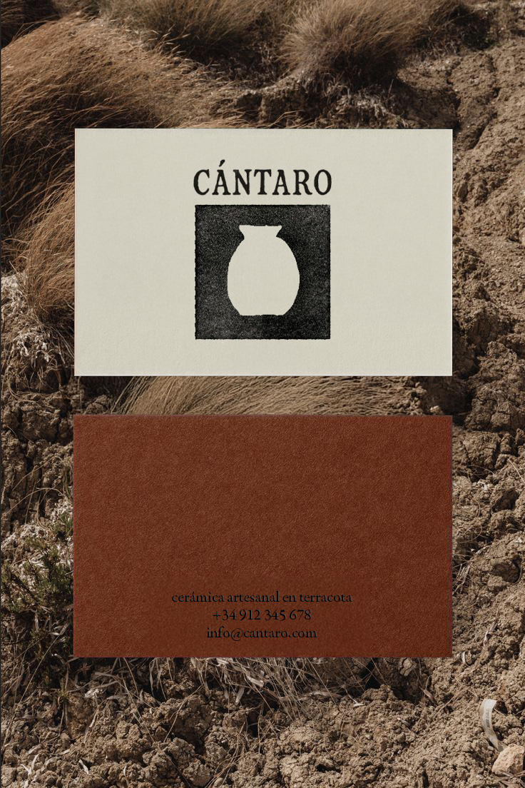
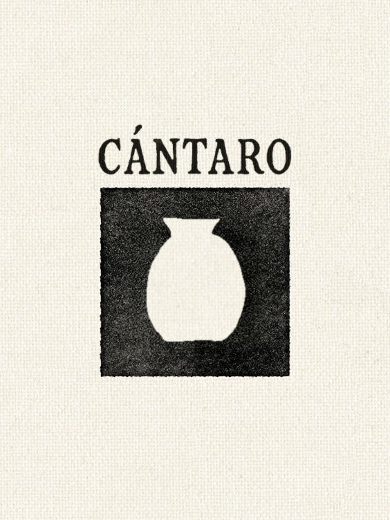
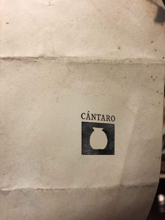
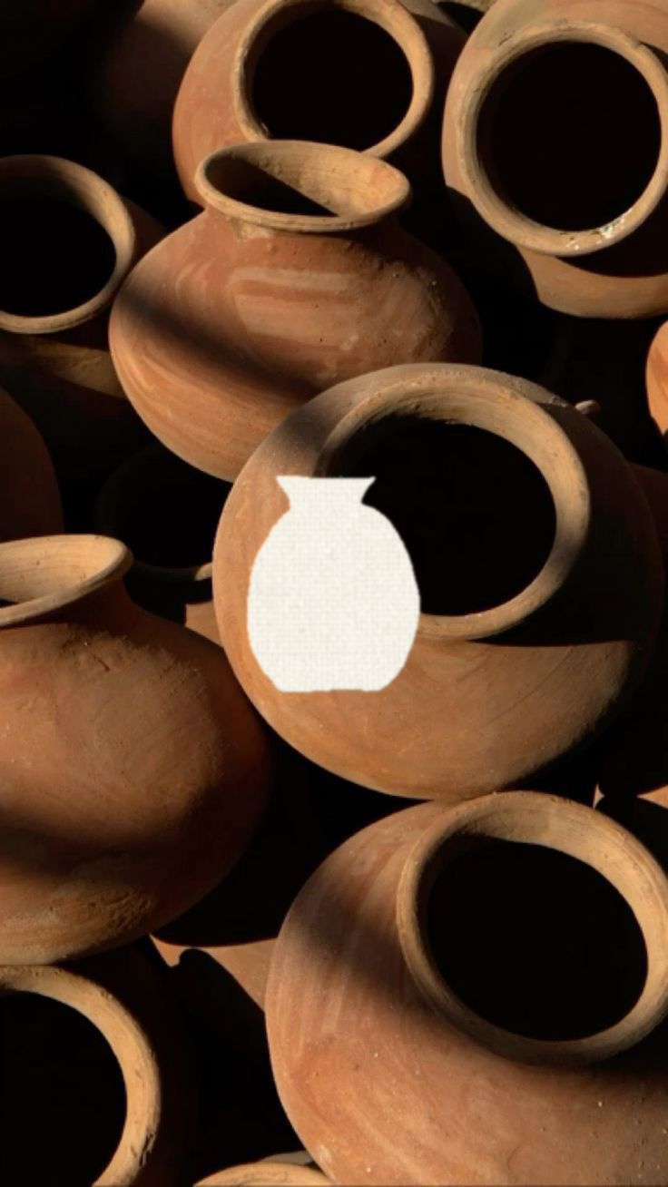
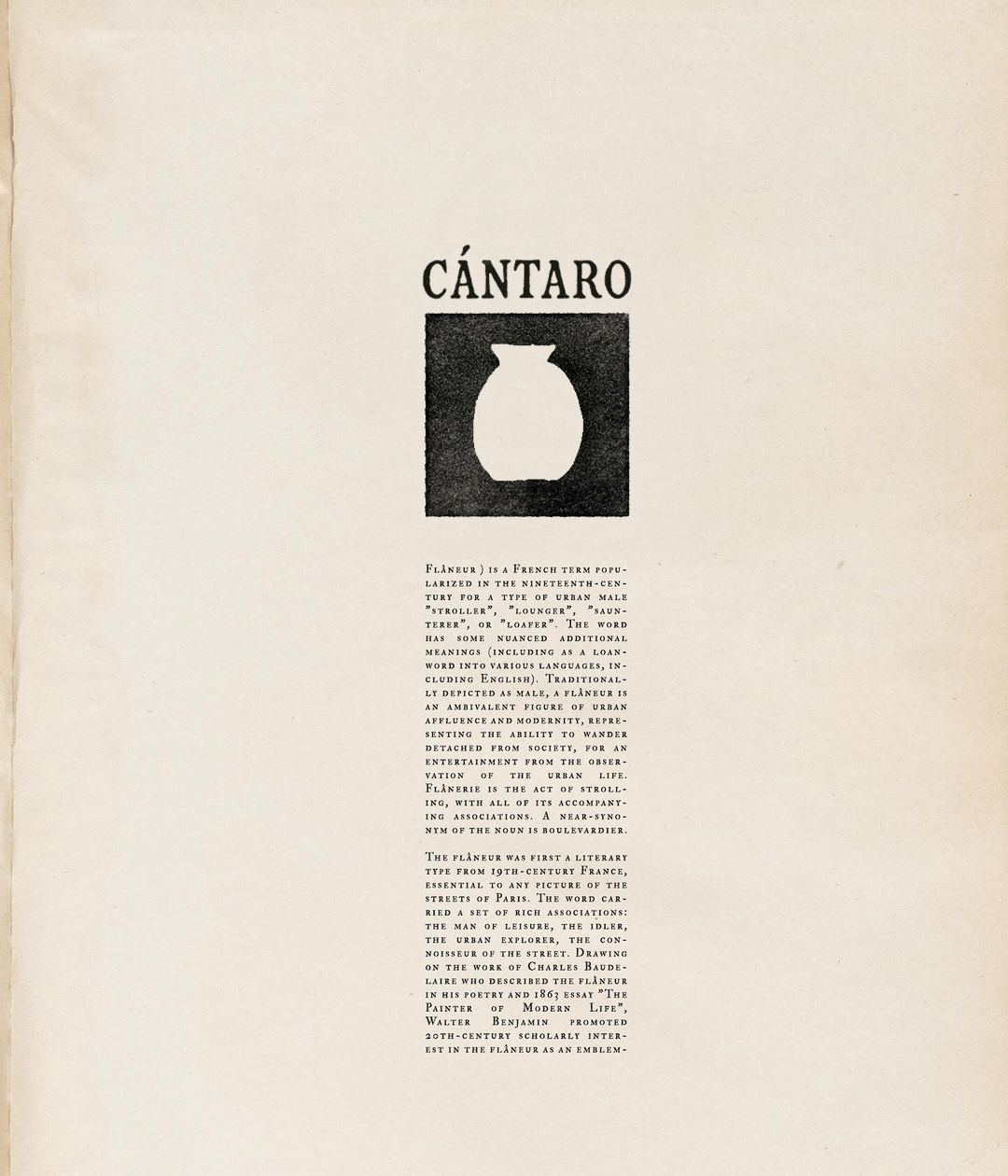
Cántaro is a project of artisanal terracotta ceramics rooted in essential forms and local materials. The identity draws from the cántaro, the traditional Mediterranean vessel once used to carry water and wine: an everyday object, archetypal and timeless, here transformed into a graphic symbol. Its silhouette is reduced to a negative mark, carved within a dark square, evoking an imprint — a trace that endures through time.
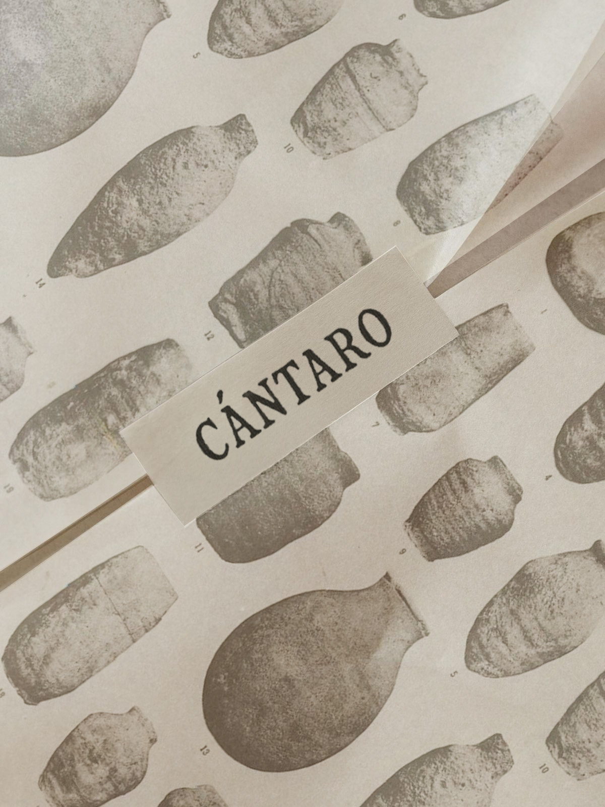
A clean serif typeface complements the logo with precision, while the chosen materials — porous papers, earthy textures, a warm and neutral palette — echo the physicality of terracotta and the landscape it originates from. The art direction works by subtraction, allowing the raw strength of matter and craft to emerge. From logo and packaging to printed matter and photography, every element contributes to a coherent, grounded visual language.
Outcome. A tactile and timeless identity that conveys authenticity and permanence. The cántaro becomes a narrative emblem and visual bridge between craftsmanship, Mediterranean tradition, and contemporary culture.
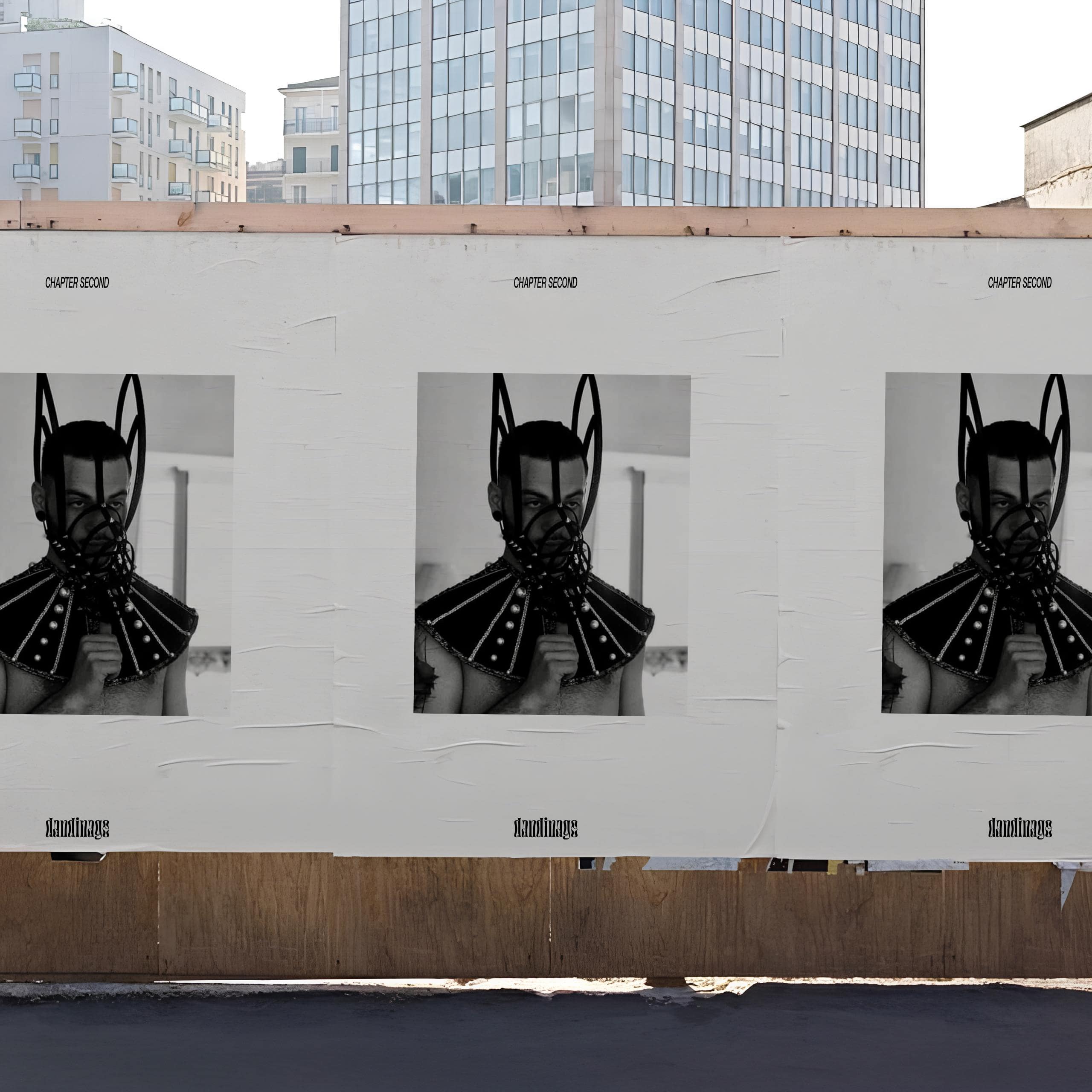
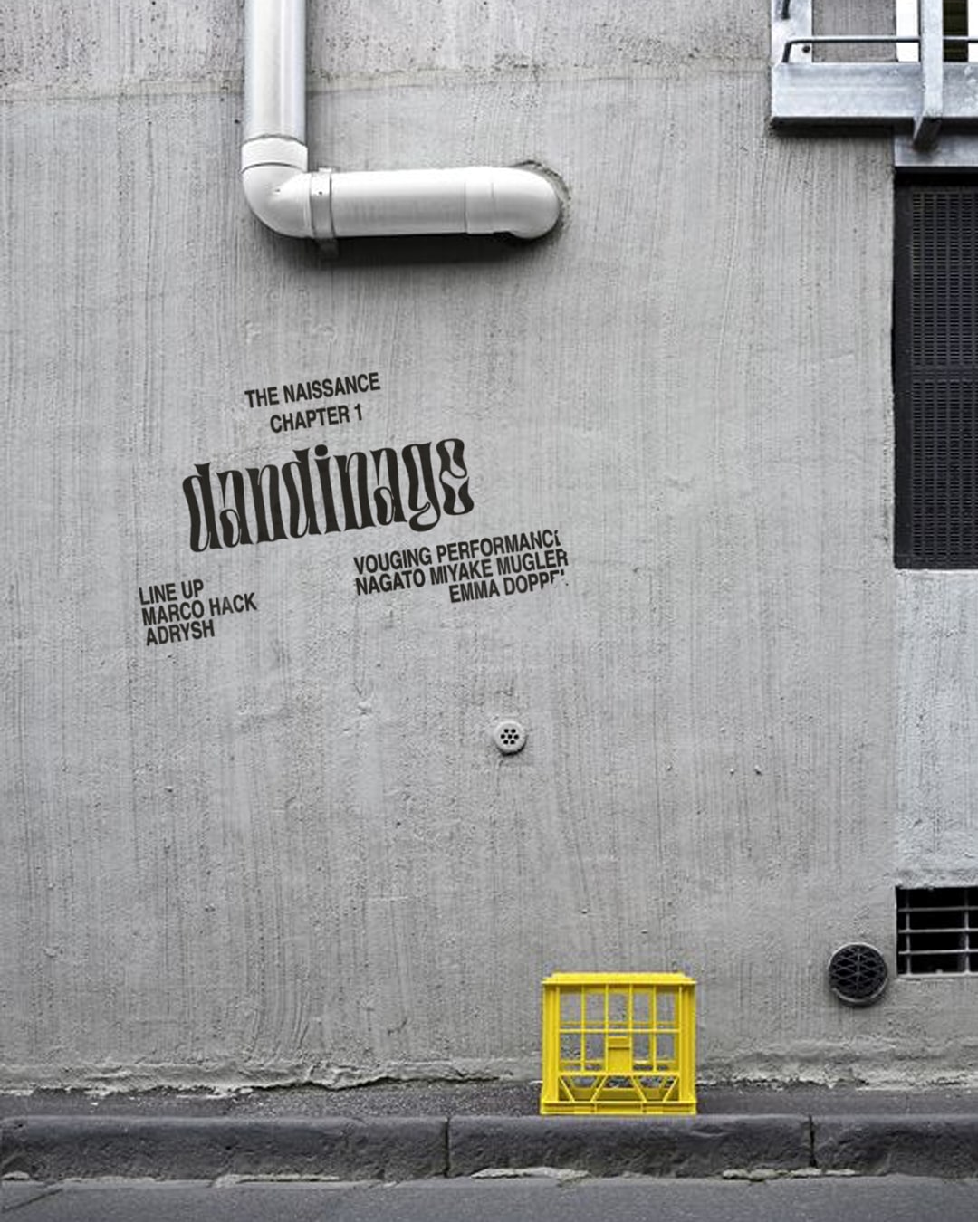
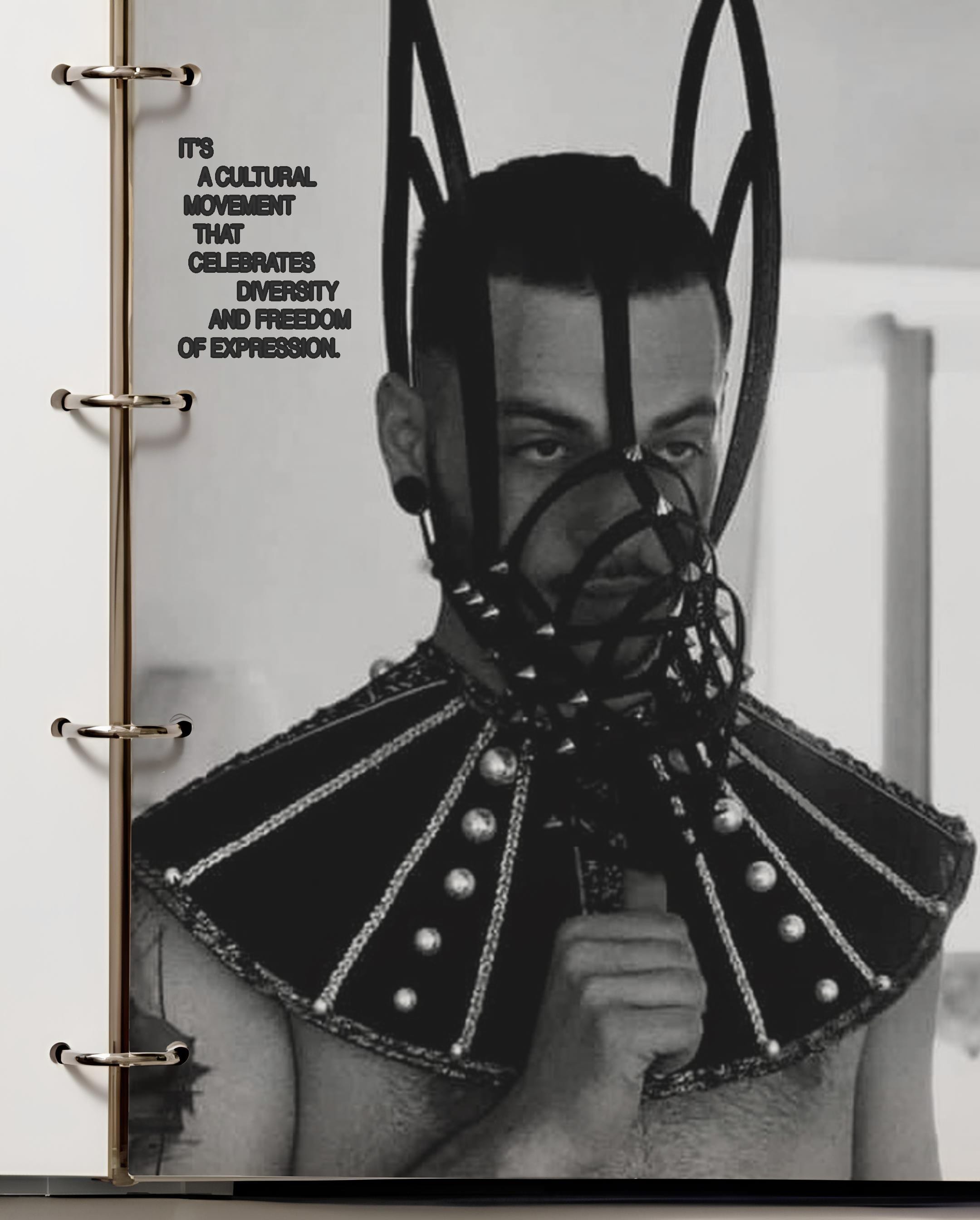
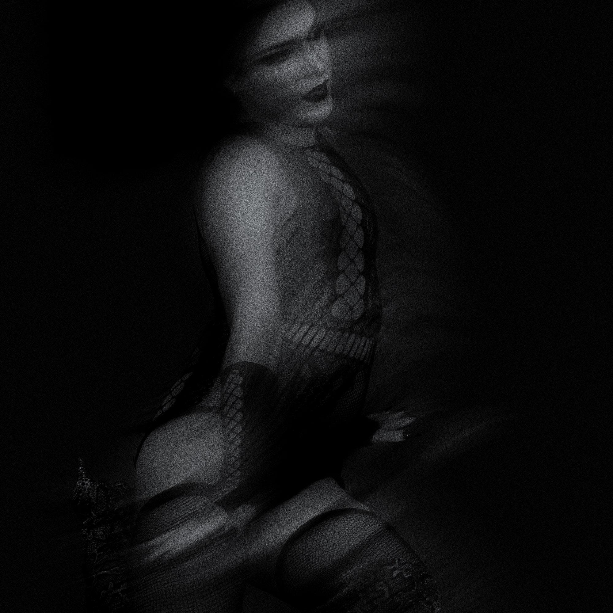
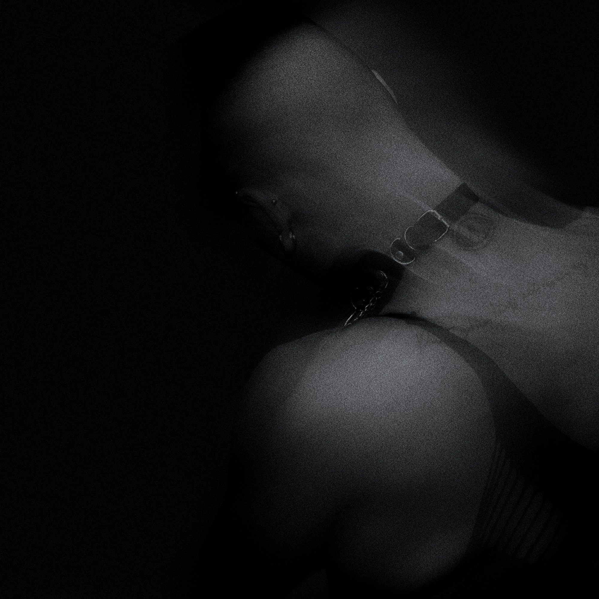
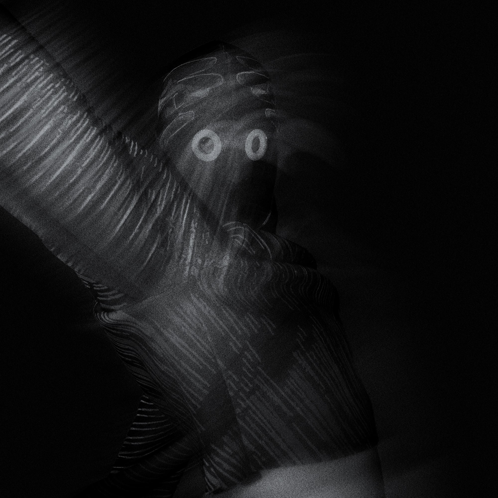
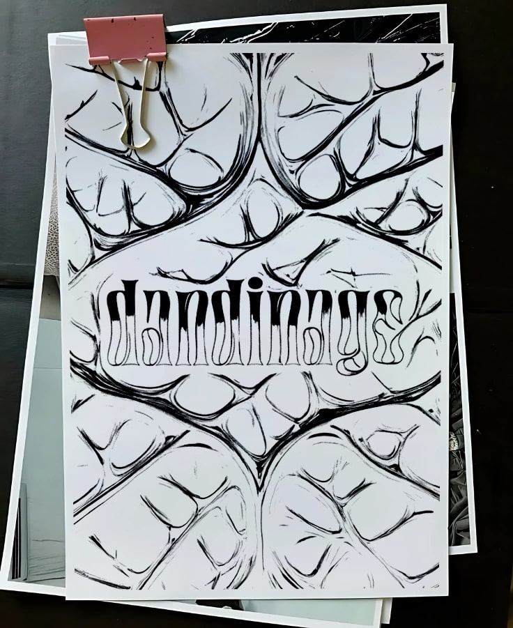
Dandinage is a project founded and curated by Eleonora Sicolo and Elisa Gigliotti, with the goal of redefining queer nightlife through an immersive, multidisciplinary experience. Born in Milan as a response to the challenges faced by the LGBTQIA+ community in historically queer spaces, Dandinage is an event that weaves together art, performance, and club culture to create a safe and inclusive environment. The name, inspired by the French word for “swaying,” symbolizes the fluidity and resilience of queer identity.
Concept and Artistic Direction
The project is structured in chapters, each featuring a unique visual and performative narrative. Every event is a thematic exploration that blends avant-garde aesthetics, references to the history of club culture, and a strong message of freedom and self-expression. For the second chapter, “CHAPTER SECOND,” we drew inspiration from the iconic Club Kids movement of 1980s/90s New York, combining elements of futurism and social critique.
The artistic direction focused on:
~ A lineup of queer performers spanning voguing, drag performances, interactivity, and sex expression performances.
~ Set design that transforms the space into an immersive, visionary environment.
~ Visual identity inspired by underground club aesthetics, combined with digital elements and glitch art.
Role and Contribution
We were responsible for:
~ Artistic direction and concept development.
~ Visual identity and communication.
~ Selection and coordination of performers and DJs.
~ User experience and curation of interactive spaces.
Dandinage is not just a party, but a cultural movement that celebrates diversity and freedom of expression. Through a powerful visual and performative language, the project aims to build a bridge between club culture, contemporary art, and queer activism.
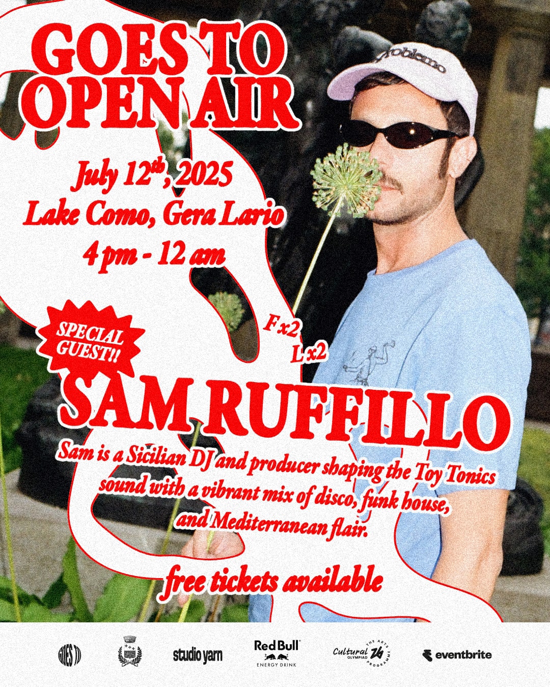
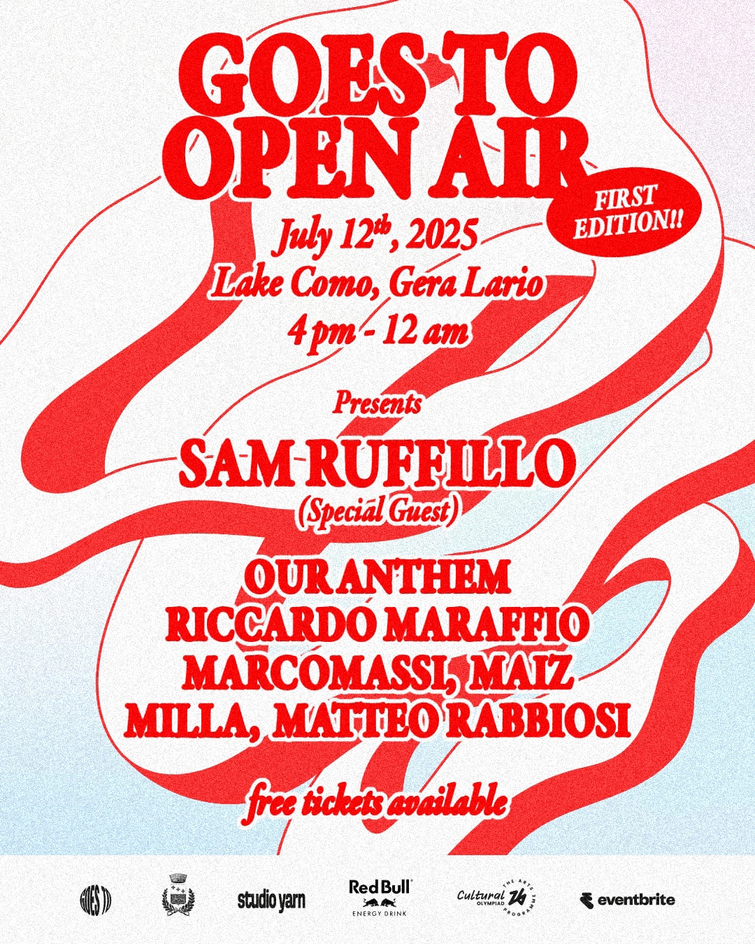
Goes To Open Air is an electronic music festival created with the ambition of bringing club culture to the shores of Lake Como. Its first edition took place in the summer of 2025 in Gera Lario, attracting more than 2,500 attendees and building a strong presence both locally and online, with over 800,000 impressions and more than 85,000 accounts reached. The project also involved partners such as Red Bull and Milano Cortina 2026.
We were responsible for the art direction and visual identity development of the festival.
The graphics were built around a central element that recurs throughout all visual applications: a fluid shape inspired by a wave, positioned somewhere between a sound wave and the waves of the lake. This graphic device became the defining thread of the identity, generating movement and dynamism across every application.
Our work also included coordinating the creative teams involved in the project: social media managers, content creators, videographers, photographers, set designers and fashion designers. An integrated creative direction process that ensured consistency across disciplines, from digital communication to on-site production.
Outcome. An energetic and distinctive visual identity, capable of expressing the festival across multiple dimensions, digital, live and local, contributing to the launch of a new independent event on Lake Como and supporting its growth through coordinated communication, strategic partnerships and strong community engagement.
Video. Giacomo Marinoni